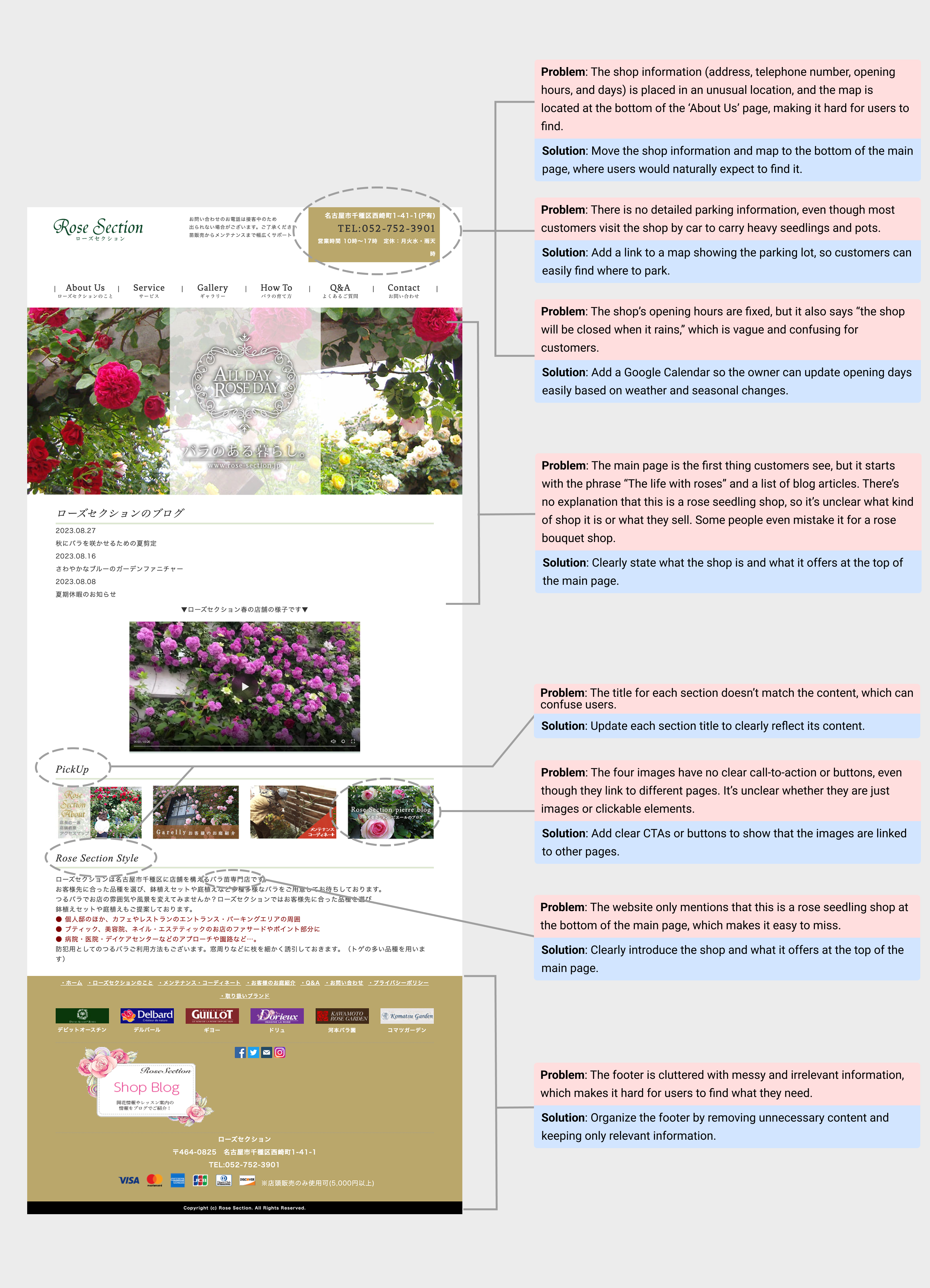
Rose Section is a shop that sells rose seedlings offline. They had a website built over 10 years ago, and the owner wanted to update its outdated design. That’s why I started this redesign project.But the real issue wasn’t just the old design. The website didn’t communicate clearly, important information was hard to find, and navigation was confusing for users.To understand the challenges better, I spoke with the owner and an employee to learn what customers actually want to know when visiting the site.
To evaluate the impact of the redesign, I followed up with the client 3 and 6 months after launch.
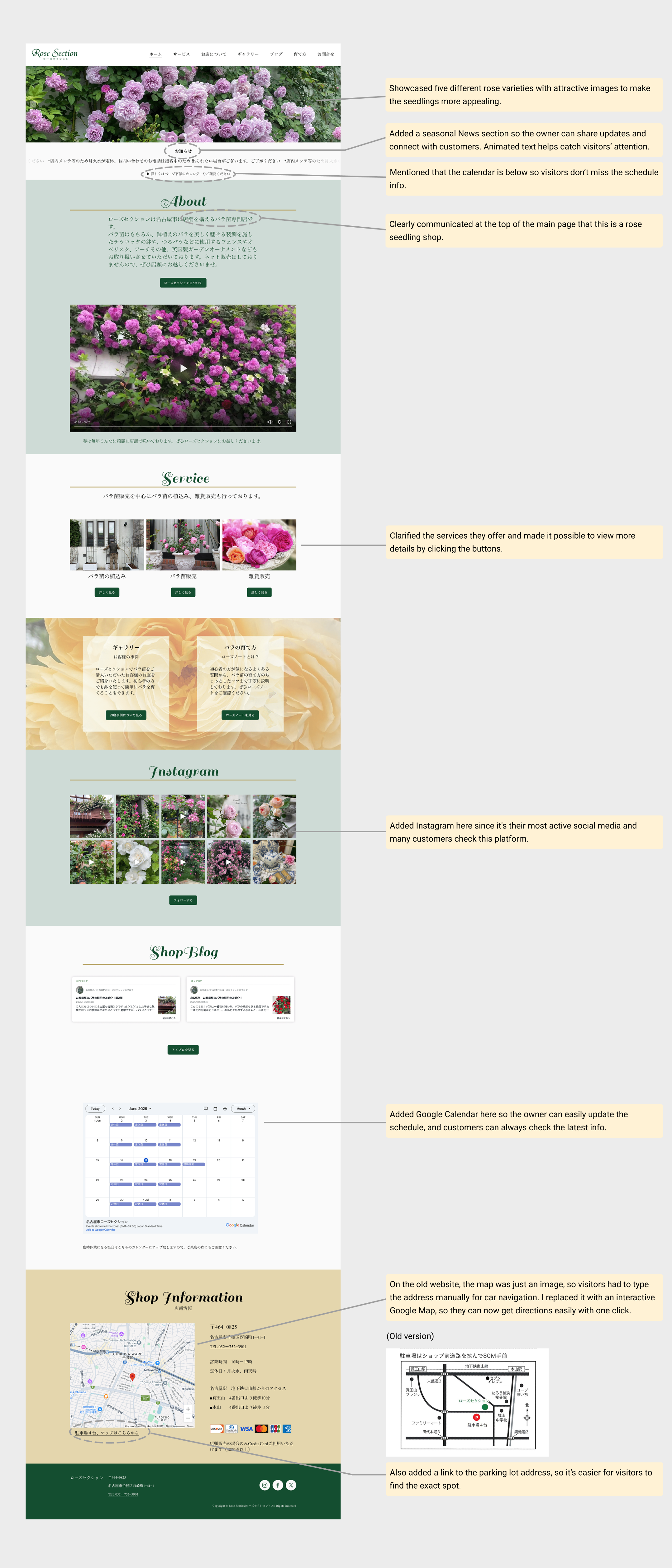
Qualitative: Customers described the new design as simpler and easier to navigate, which aligned with our UX goal of reducing friction.
Quantitative: Customer inquiries dropped by an estimated 70%, particularly around recurring topics such as:
Parking location → inquiries disappeared completely
Opening hours → users could easily find them
Confusion about the “rose section” → significantly reduced
These changes indicated that users could better find information on their own, showing clear improvements in usability and content clarity.
The owner wasn’t familiar with design terminology, but she had clear preferences and ideas. I learned how important it is to explain design decisions in simple, jargon-free language and to actively listen to the client’s perspective. When our ideas didn’t fully align, I offered alternative design options or found compromises that respected her vision while still maintaining usability.